library(tidyverse)
library(palmerpenguins)

penguins |>
  ggplot(aes(x = flipper_length_mm, y = body_mass_g)) +
  geom_point() +
  labs(
    x = "Flipper length (mm)",
    y = "Body mass (g)")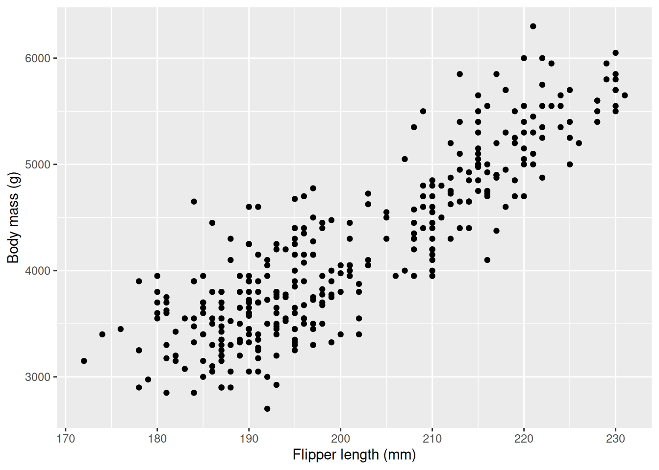
In the previous chapter we studied hypothesis testing and learned how we can answer questions about the population using our data, at a significance level. This is very useful to understand different quantities in the population, but what if we want to find out how one variable depends on another? In our previous example we saw that we could understand the distribution of Antarctic penguins body masses by first grouping by species and then, within each species, grouping by sex. This is possible because species and sex are categorical variables, but we cannot use the same method if we want to know the effect of numerical variables. For this, we can use linear regression, a statistical method used to model the (linear) relationship between two continuous variables: a single predictor (independent) variable and a response (dependent) variable. When we use linear regression we model the relationship between two variables using a line, characterized by the linear equation \(y = k \cdot x + m\). Independent variables and dependent variables have several names in different fields (and within fields!), and we will be using a few of them. For independent variables we may say explanatory variables, predictors, covariates, or features and for dependent variable we may say response or outcome. It may cause some confusion in the beginning, but once you understand that they are all the same it will help you understand data analysis in different fields and from different sources.
For a more technical/mathematical introduction to linear regression, please consult the chapter on linear regression (Chapter 3, 2nd edition) in An Introduction to Statistical Learning.
In this chapter we will continue to look at body_mass_g from the penguins dataset. In the previous chapter we studied the body weight with respect to species and sex, but our analysis was limited to categorical variables. This time we will expand our analysis to the relationship between body mass and other numerical variables. This may be useful if we can predict a penguins weight based on other body measures. It may be easier measuring the bill and flippers on a penguin than getting it to stand on a scale(?).
We start by visualizing the relationship between flipper length and body mass using a scatter plot (geom_point).
library(tidyverse)
library(palmerpenguins)
penguins |>
ggplot(aes(x = flipper_length_mm, y = body_mass_g)) +
geom_point() +
labs(
x = "Flipper length (mm)",
y = "Body mass (g)")
We can clearly see that the body mass increases with flipper length: penguins with longer flippers have larger body mass, on average. It is important to note that this relationship holds on average and not for every penguin, as then every point as we take a step to the right would be higher up, but this is not the case. We illustrate what this means below as we draw two vertical lines, creating three bins, then calculate the mean body weight within the interval and plot it as red, horizontal lines.
mu_190 <- mean(penguins |> filter(flipper_length_mm < 190) |> pull(body_mass_g))
mu_210 <- mean(penguins |> filter(flipper_length_mm > 190 & flipper_length_mm < 210) |> pull(body_mass_g))
mu_230 <- mean(penguins |> filter(flipper_length_mm > 210) |> pull(body_mass_g))

penguins |>
  ggplot(aes(x = flipper_length_mm, y = body_mass_g)) +
  geom_point() +
  geom_vline(xintercept = 190, col = "black", linetype = 3) +
  geom_vline(xintercept = 210, col = "black", linetype = 3) +
  geom_segment(x = 170, xend = 190,  y = mu_190, yend = mu_190, color = "red") +
  geom_segment(x = 190, xend = 210,  y = mu_210, yend = mu_210, color = "red") +
  geom_segment(x = 210, xend = 230,  y = mu_230, yend = mu_230, color = "red") +
  labs(
    x = "Flipper length (mm)",
    y = "Body mass (g)")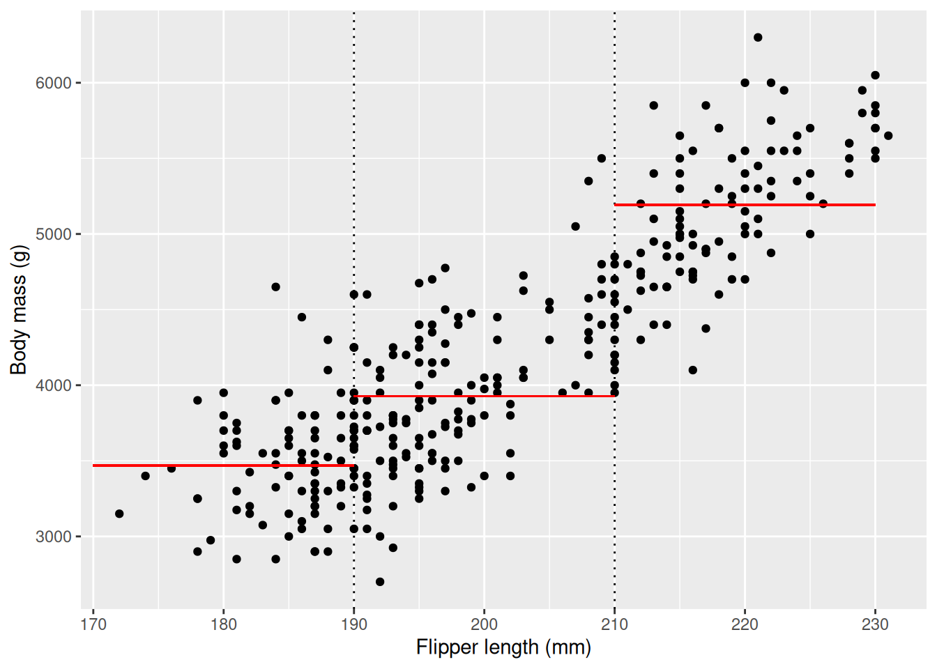
Here we can clearly see that the average of our dependent variable, body mass, increases as our independent variable, flipper length, increases. We could follow the approach of the previous chapter and divide the penguins into three groups and perform t-tests between the groups to see if the difference is statistically significant.
flippers_190 <- penguins |>
  filter(flipper_length_mm < 190) |>
  pull(body_mass_g)
flippers_210 <- penguins |>
  filter(flipper_length_mm > 190 & flipper_length_mm < 210) |>
  pull(body_mass_g)
flippers_230 <- penguins |>
  filter(flipper_length_mm > 210) |>
  pull(body_mass_g)

t.test(flippers_190, flippers_210)$p.value
[1] 8.653392e-13t.test(flippers_210, flippers_230)$p.value[1] 4.958129e-52We see that both \(p\)-values are significant at significance level 0.05. This is very useful information, as if we know that a penguin falls into one of these bins we can assume it’s body mass will be close to average within that bin. If we make more bins we can make our predictions more accurate, and maybe we can even say something about how much the body mass increases, on average, with the flipper length. This is exactly the goal of linear regression, where we create a line that represents one bin for every possible value for flipper_length_mm. You have already seen linear regressions before, graphically, using the geom_smooth function with parameter method = lm. lm stands for “Linear Model”, and is the name of the R function used to perform linear regression. First, we visualize the line, then we will calculate our linear model.
penguins |>
  ggplot(aes(x = flipper_length_mm, y = body_mass_g)) +
  geom_point() +
  geom_smooth(method = "lm", se = FALSE) +
  labs(
    x = "Flipper length (mm)",
    y = "Body mass (g)")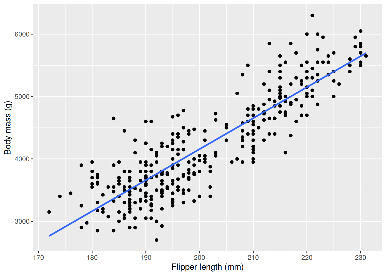
The line you see describes how body_mass_g increases with flipper_length_mm, on average. If you want to know the average body mass for a specific flipper length you just have to follow a vertical line from that value on the x axis to the line, as in the example below where we use the line to get the average body mass of a penguin with flipper length 200 mm.
x <- 200
model <- penguins |>
  lm(formula = body_mass_g ~ flipper_length_mm)
prediction <- data.frame(
  flipper_length_mm = x,
  body_mass_g = model |> predict(data.frame(flipper_length_mm = x)))

penguins |>
  ggplot(aes(x = flipper_length_mm, y = body_mass_g)) +
  geom_point() +
  geom_smooth(method = "lm", se = FALSE) +
  geom_segment(x = prediction$flipper_length_mm, xend = prediction$flipper_length_mm,  y = 0, yend = prediction$body_mass_g, color = "black", linetype = 2, linewidth = 0.2) +
  geom_segment(x = 0, xend = prediction$flipper_length_mm,  y = prediction$body_mass_g, yend = prediction$body_mass_g, color = "black", linetype = 2, linewidth = 0.2) +
  scale_x_continuous(breaks = c(prediction$flipper_length_mm)) +
  scale_y_continuous(breaks = round(c(prediction$body_mass_g))) +
  geom_point(data = prediction, col = "red", size = 3) +
  labs(
    x = "Flipper length (mm)",
    y = "Body mass (g)")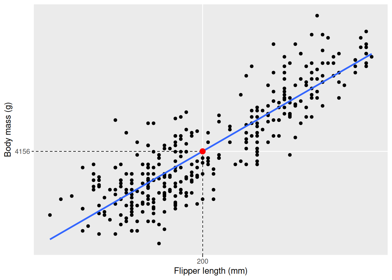
x to 201. How much did the body mass increase? Note that we use the function round to round the value of body mass. This provides nicer output in the plot, but may induce a slight error (see next section where the exact numbers are used).x <- 200
model <- penguins |>
lm(formula = body_mass_g ~ flipper_length_mm)
prediction <- data.frame(
flipper_length_mm = x,
body_mass_g = model |> predict(data.frame(flipper_length_mm = x)))
penguins |>
ggplot(aes(x = flipper_length_mm, y = body_mass_g)) +
geom_point() +
geom_smooth(method = "lm", se = FALSE) +
geom_segment(x = prediction$flipper_length_mm, xend = prediction$flipper_length_mm, y = 0, yend = prediction$body_mass_g, color = "black", linetype = 2, linewidth = 0.2) +
geom_segment(x = 0, xend = prediction$flipper_length_mm, y = prediction$body_mass_g, yend = prediction$body_mass_g, color = "black", linetype = 2, linewidth = 0.2) +
scale_x_continuous(breaks = c(prediction$flipper_length_mm)) +
scale_y_continuous(breaks = round(c(prediction$body_mass_g))) +
geom_point(data = prediction, col = "red", size = 3) +
labs(
x = "Flipper length (mm)",
y = "Body mass (g)")x-value to 100. What is the predicted body mass? Is this a reasonable result? Why is this happening?Now when we have seen what a linear model looks like we are ready to understand the capabilities of this model. Just as before we can ask ourselves if the linear relationship is statistically significant and how much the average body weight increases with flipper length. We use the lm function in R to estimate a linear model. When estimating a model we need to specify the dependent variable, the variable we are interested in as our outcome, and the independent variable, the variable we expect will explain the outcome. We do so by specifying a formula that follows the syntax formula = dependent ~ independent, so in our case we use formula = body_mass_g ~ flipper_length_mm.
model <- penguins |>
  lm(formula = body_mass_g ~ flipper_length_mm)
model
Call:
lm(formula = body_mass_g ~ flipper_length_mm, data = penguins)

Coefficients:
      (Intercept)  flipper_length_mm
         -5780.83              49.69
From the output we can see the coefficients of the model. The coefficients in this model are the \(m\) and \(k\) values in our linear equation, \(y = k \cdot x + m\)1, where the coefficient under “(Intercept)” is the \(m\) and under “flipper_length_mm” is the \(k\), the slope of the line. The slope tells us how much body mass increases on average with every mm the flipper length increases. From our example before we saw that a penguin with flipper length 200 mm on average weigh 4156 g. According to our model a penguin with flipper length 201 mm would weigh \(4156.282 + 49.69 \approx 4206\) g (using exact values in the addition), increasing by one slope, i.e. the value under “Coefficients: flipper_length_mm”. The coefficient of the independent variable is of special interest, as it can tell us about the effect one variable has on the other. The intercept, \(m\), in our case represents the body mass of a penguin with flipper length 0, which doesn’t make much sense. The intercept may be interesting in some cases, but you can safely ignore it in cases when it clearly doesn’t make any sense. It is important to remember the data used to fit the model, as there are no penguins with flippers shorter than 172 mm or longer than 231 mm, and that our model is not fitted to predict values outside of this. Always be mindful when using your model outside the range of your sample.
The output from the model is not very detailed, instead we are more interested the summary of the model.
model_summary <- summary(model)
model_summary
Call:
lm(formula = body_mass_g ~ flipper_length_mm, data = penguins)

Residuals:
     Min       1Q   Median       3Q      Max
-1058.80  -259.27   -26.88   247.33  1288.69

Coefficients:
                   Estimate Std. Error t value Pr(>|t|)
(Intercept)       -5780.831    305.815  -18.90   <2e-16 ***
flipper_length_mm    49.686      1.518   32.72   <2e-16 ***
---
Signif. codes:  0 '***' 0.001 '**' 0.01 '*' 0.05 '.' 0.1 ' ' 1

Residual standard error: 394.3 on 340 degrees of freedom
  (2 observations deleted due to missingness)
Multiple R-squared:  0.759, Adjusted R-squared:  0.7583
F-statistic:  1071 on 1 and 340 DF,  p-value: < 2.2e-16
This provides a much richer output. We can again see the coefficients, but now with a lot more detail. We still find the estimated values of the coefficients under the column “Estimate”, but equally (if not more) important is the value under “Pr(>|t|)”. In this column we find a \(p\)-value that tells how likely it is to get the linear relationship we have in our data if there is in fact no relationship in the underlying population of penguins. Specifically, the \(p\)-value tests the hypothesis:
\(H_0\): There is no linear relationship between flipper length and body mass.
\(H_a\): There is a linear relationship between flipper length and body mass.
In other words, this means that the coefficient for flipper_length_mm is either zero or non-zero:
\(H_0\): The coefficient for flipper length is 0.
\(H_a\): The coefficient for flipper length is not 0.
If the \(p\)-value is smaller than 0.05 we say that there is a statistically significant linear relationship between our variables at significance level 0.05. We also have a \(p\)-value for the intercept, testing if the intercept is significantly different from 0, which is not interesting in our case. We can also output the results more concisely by accessing the coefficients using the dollar operator.
model_summary$coefficients Estimate Std. Error t value Pr(>|t|)
(Intercept) -5780.83136 305.814504 -18.90306 5.587301e-55
flipper_length_mm 49.68557 1.518404 32.72223 4.370681e-107Hypothesis testing gives linear regression a powerful interpretation: if the \(p\)-value for the coefficient for the dependent variable we have evidence of a linear relationship between the variables. Sometimes this can also be interpreted as a causal effect, that the predictor is a cause of the outcome, however this requires more assumptions and we should be careful drawing causal conclusions based on correlations. For example, in medical studies this is of particular importance: we ideally want a drug to have a causal effect on the outcome of a disease.
flipper_length_mm ~ body_mass_g. How does the flipper length change on average when the body mass increases with one gram? Is it possible to distinguish any causal effect here?geom_point and geom_smooth with method = "lm") and fit a linear regression model of sales ~ month. Is the result as you expect? Do we have a linear relationship?# Simulating data
day <- seq(0, 12, length.out = 356)
sales <- 400 * sin(pi * day / 12)
ice_cream <- tibble(day = day, sales = sales)body_mass_g ~ species. What do you expect will happen? This model will be discussed in the next section.body_mass_g ~ species for Gentoo penguins only. Compare the \(p\)-values.# t-test
female_gentoo_body_mass <- penguins |>
filter(species == "Gentoo" & sex == "female") |>
select(body_mass_g) |>
drop_na()
male_gentoo_body_mass <- penguins |>
filter(species == "Gentoo" & sex == "male") |>
select(body_mass_g) |>
drop_na()
t.test(male_gentoo_body_mass, female_gentoo_body_mass)
# Linear regression
penguins |>
filter(species == "Gentoo") |>
lm(formula = body_mass_g ~ sex) |>
summary()In the previous exercises we saw that we can fit a linear model with a categorical variable as the independent variable, similarly to the t-test in the previous chapter. We will take a look at the summary output to better understand how this is done. We start by analyzing body_weight_g ~ species. We can visualize the distributions using a density plot with the mean values highlighted as vertical lines.
mean_bws <- penguins |>
  summarize(
    body_mass_g = mean(body_mass_g, na.rm = TRUE),
    .by = species)
penguins |>
  ggplot(aes(x = body_mass_g, fill = species, col = species)) +
  geom_density(alpha = 0.3) +
  geom_vline(
    aes(
      xintercept = body_mass_g,
      col = species),
    data = mean_bws) +
  scale_x_continuous(
    breaks = mean_bws$body_mass_g,
    labels = round(mean_bws$body_mass_g),
    guide = guide_axis(n.dodge=3)) +
  labs(
    x = "Body mass (g)",
    y = "",
    col = "Species",
    fill = "Species") +
  theme(axis.text.y = element_blank(),
        axis.ticks.y = element_blank())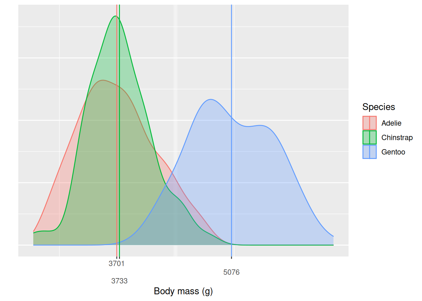
We see that Gentoo penguins are in general larger, with most of the density situated above the other two species and the mean body mass more than one kg heavier than the other two species. Chinstrap and Adelie penguins on the other hand have very similar body masses, with the Chinstraps being a little heavier on average. A natural question is if this difference is significant, is it only present in our sample or can we say that there is a difference between the populations? Before we used t-test, but now we will fit a linear model with species as our independent variable. We immediately store the summary output and look only at the coefficients.
model_summary <- penguins |>
  lm(formula = body_mass_g ~ species) |>
  summary()
model_summary$coefficients
Estimate Std. Error t value Pr(>|t|)
(Intercept) 3700.66225 37.61935 98.3712321 2.488024e-251
speciesChinstrap 32.42598 67.51168 0.4803018 6.313226e-01
speciesGentoo 1375.35401 56.14797 24.4951686 5.420612e-77We see that we have three coefficients, the intercept, one for “speciesChinstrap” and one for “speciesGentoo”. Whenever we include a categorical variable as a predictor the coefficients for that variable represents the difference of that level to a reference, in this case Adelie. Here we can actually interpret the intercept as something useful, as it is the mean body weight of the Adelie penguins. The coefficients for Chinstrap and Gentoo respectively is the difference between the Adelie mean body weight and the Chinstrap and Gentoo mean body weight respectively. From the output we can conclude that on average Chinstrap penguins weigh \(\sim 32\) g more than Adelie penguins and Gentoo penguins weigh \(\sim 1.4\) kg more than Adelie penguins. The \(p\)-values, from the “Pr(>|t|)” column, tells us if the mean of the Adelie species is different from the mean of the Chinstrap and Gentoo respectively. lm selects the baseline by itself. We can formulate the hypotheses for the tests generating the \(p\)-values of “speciesChinstrap” and “speciesGentoo”
speciesChinstrap
\(H_0\): There is no difference in the mean body weight of Adelie and Chinstrap penguins.
\(H_a\): There is a difference in the mean body weight of Adelie and Chinstrap penguins.
and likewise for
speciesGentoo
\(H_0\): There is no difference in the mean body weight of Adelie and Gentoo penguins.
\(H_a\): There is a difference in the mean body weight of Adelie and Gentoo penguins.
In this case the \(p\)-value for “speciesGentoo” is significant but the \(p\)-value for “speciesChinstrap” is not. We can say that we don’t have evidence in the data that Adelie and Chinstrap penguins have different body mass on average, but that Adelie and Gentoo have. We have now used linear regression to perform a similar test to a t-test, but testing multiple hypotheses at the same time, showing the versatility of linear regression for hypotheses testing.
island instead of species. Note which island lm chooses as the reference and think about how that impacts the result.penguins_re.penguins_re <- penguins |> mutate(island = relevel(island, ref = "Torgersen"))body_mass_g ~ island for only the Adelie penguins. Does island have an affect on body mass, i.e. is one of the coefficients statistically significant at significance level 0.05?After seeing the versatility of linear regression it may be tempting to go ahead and fit linear models for any possible relationship in our data without much hesitation. However, it is often a good idea to perform EDA before any regression analysis to understand what relationships we can/should model and if the result from the regression makes sense according to our intuition. Sometimes a relationship will appear strange or surprising when performing linear regression. We fit a linear model on body_mass_g ~ bill_depth_mm, expecting that bigger penguins have bigger bills, i.e. bill depth.
model_summary <- penguins |>
  lm(formula = body_mass_g ~ bill_depth_mm) |>
  summary()
model_summary$coefficients
Estimate Std. Error t value Pr(>|t|)
(Intercept) 7488.6524 335.21782 22.339661 1.133457e-68
bill_depth_mm -191.6428 19.41698 -9.869853 2.276941e-20We see that the coefficient for bill_depth_mm is negative, saying that body mass decreases on average by \(\sim191\) g for every mm the bill depth increases! This seems counter intuitive, so we can further investigate by visualizing the relationship.
penguins |>
  ggplot(aes(x = bill_depth_mm, y = body_mass_g)) +
  geom_point() +
  geom_smooth(method = "lm", se = FALSE) +
  labs(
    x = "Bill depth (mm)",
    y = "Body mass (g)")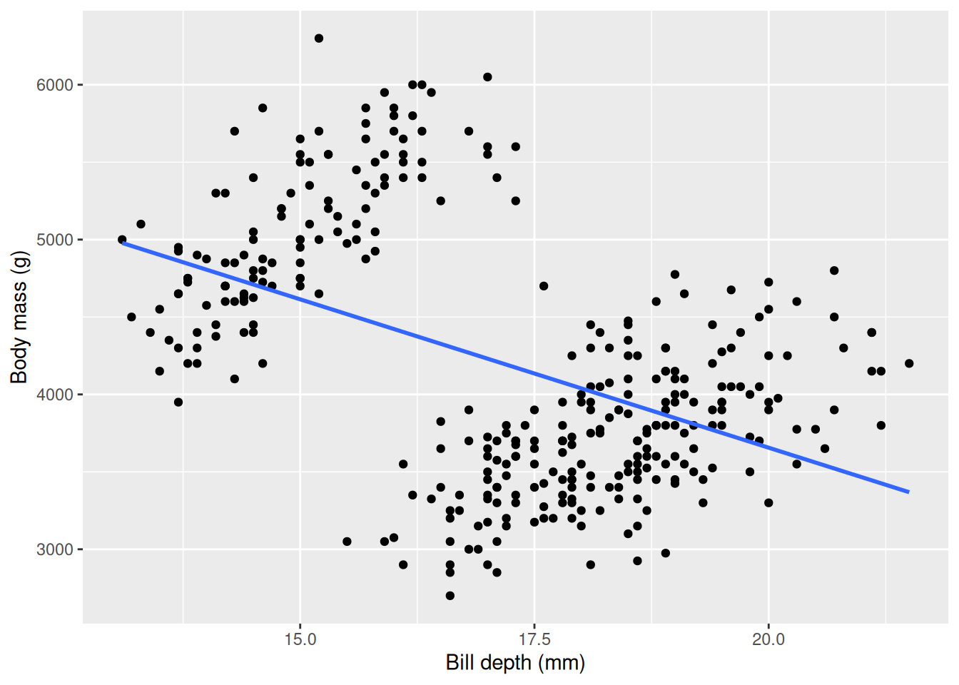
Our plot confirms our result, but something seems “fishy”: there are two clear “point clouds” in our plot and the line goes through both of them. We can suspect the clouds represents different groups or categories. We have learned before that the body mass is very different between the different species, so we can color the points based on the species and fit individual lines for each species and see if we can disentangle this strange relationship.
penguins |>
  ggplot(aes(x = bill_depth_mm, y = body_mass_g)) +
  geom_point(aes(col = species)) +
  geom_smooth(aes(col = species), method = "lm", se = FALSE) +
  labs(
    x = "Bill depth (mm)",
    y = "Body mass (g)",
    col = "Species")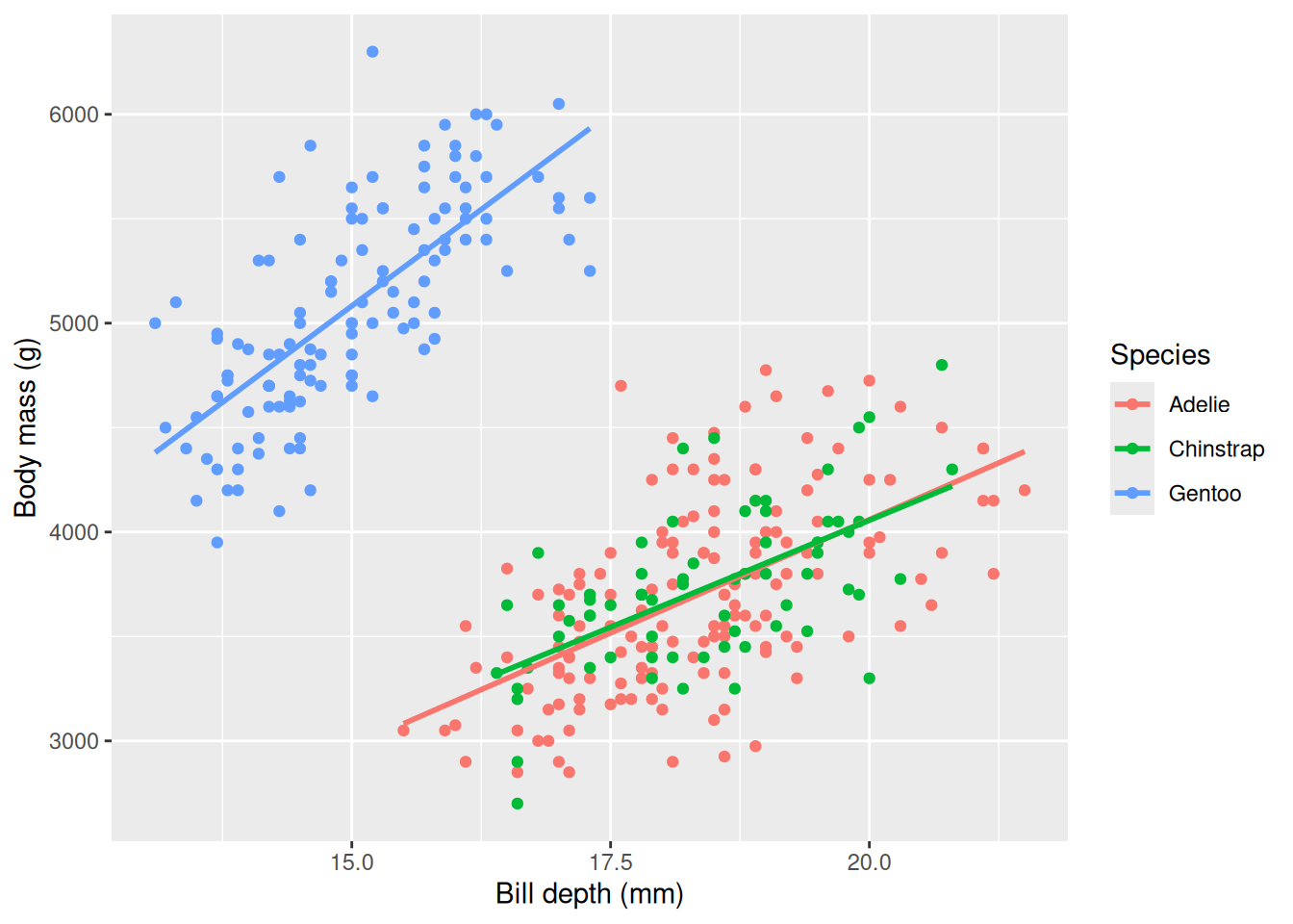
We see that the different species of penguins are responsible for the negative slope, and within each species it seems that the slope is indeed positive. This is an example of Simpson’s paradox, where a relationship is different within subgroups. We can include species in our linear model using a + sign in the formula, body_mass_g ~ bill_depth_mm + species to account for the difference.
model_summary <- penguins |>
  lm(formula = body_mass_g ~ bill_depth_mm + species) |>
  summary()
model_summary$coefficients
Estimate Std. Error t value Pr(>|t|)
(Intercept) -1007.28112 323.56097 -3.1131107 2.009294e-03
bill_depth_mm 256.61461 17.56282 14.6112380 8.100884e-38
speciesChinstrap 13.37732 52.94712 0.2526544 8.006889e-01
speciesGentoo 2238.66811 73.68183 30.3829071 1.157366e-98In our new model we see that we have a positive relationship between bill depth and body mass since we now take species into account, and the model now says that body mass increases on average with \(\sim 256\) g per mm the bill depth increases. In the next chapter you will learn more about multiple linear regression.
species would be significant when fitting the model body_mass_g ~ flipper_length_mm + species. Note that the line is calculated based on all species, i.e. body_mass_g ~ flipper_length_mm.penguins |>
ggplot(aes(x = flipper_length_mm, y = body_mass_g)) +
geom_point(aes(col = species)) +
geom_smooth(method = "lm", se = FALSE, col = "black") +
labs(
x = "Flipper length (mm)",
y = "Body mass (g)",
col = "Species")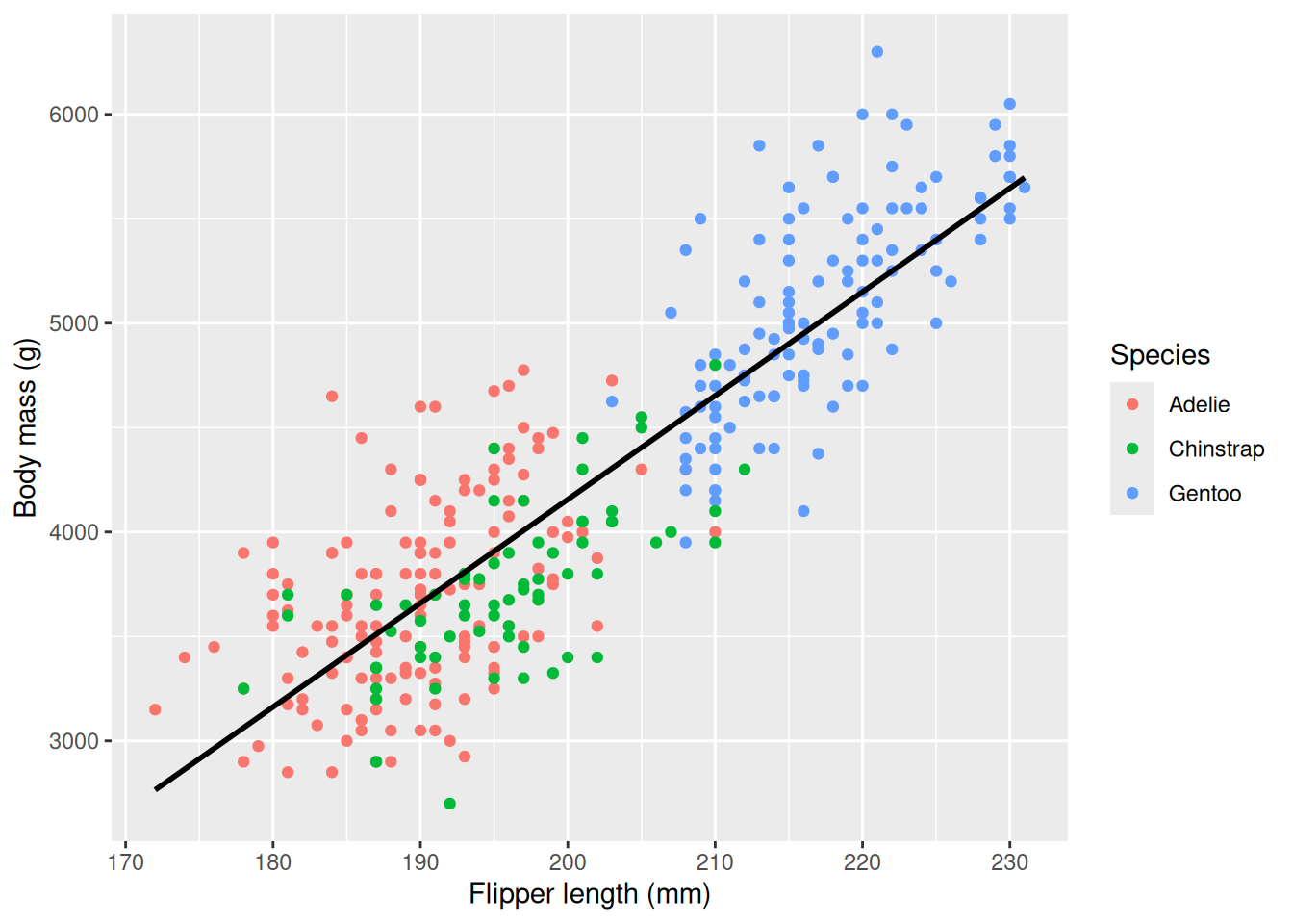
body_mass_g ~ flipper_length_mm + species to find out!We already predicted body mass based on flipper length using the fitted line and those who looked at the code may have spotted that we used the predict function. With predict we can use our model to predict body weight based on flipper lengths that we did not observe in our data. As before, we need to be careful when predicting outside the range of our sample: flippers shorter than 172 mm or longer than 231 mm. To use the predict function we need to supply a model and a data frame (or a tibble) specifying the independent variables (the predictors) that we want to use for prediction. Before we predicted the body weight of a penguin with flipper length 200 mm, now we will do it again using the predict function.
model <- penguins |>
  lm(formula = body_mass_g ~ flipper_length_mm)
model |> predict(data.frame(flipper_length_mm = 200))
1
4156.282 We see that we get the same value as before (remember that we rounded the value in the plot). The line represents the average body weight for a given flipper length, but there is no guarantee that any one penguin will fall precisely on the line. We can calculate a prediction interval using the predict function to say something about the uncertainty in the prediction. To add a prediction interval we use the argument interval = "prediction" and confidence level level = 0.95.
model |> predict(data.frame(flipper_length_mm = 200), interval = "prediction", level = 0.95) fit lwr upr
1 4156.282 3379.612 4932.951We now get two more outputs, the lower (lwr) and upper (upr) limits of our prediction. We see that the interval is quite big, and there is a lot of uncertainty regarding one penguin. The prediction interval can then be interpreted as “we are 95% confident that a new prediction will fall inside this interval”, i.e. that if we observe a previously unseen penguin with flippers 200 mm long, we are 95% confident its body mass will be within the interval. We can visualize the prediction interval for all the flipper lengths observed in our sample.
model <- penguins |>
  lm(formula = body_mass_g ~ flipper_length_mm)
predictions <- model |> predict(penguins |> select(flipper_length_mm), interval = "prediction", level = 0.95) |> as.data.frame()
penguins_pred <- penguins |>
  mutate(
    pred = predictions$fit,
    lwr = predictions$lwr,
    upr = predictions$upr)

penguins_pred |>
  ggplot(aes(x = flipper_length_mm, y = body_mass_g)) +
  geom_ribbon(aes(ymin = lwr, ymax = upr), col = "gray", alpha = 0.2) +
  geom_point() +
  geom_smooth(method = "lm", se = FALSE) +
  labs(
    x = "Flipper length (mm)",
    y = "Body mass (g)")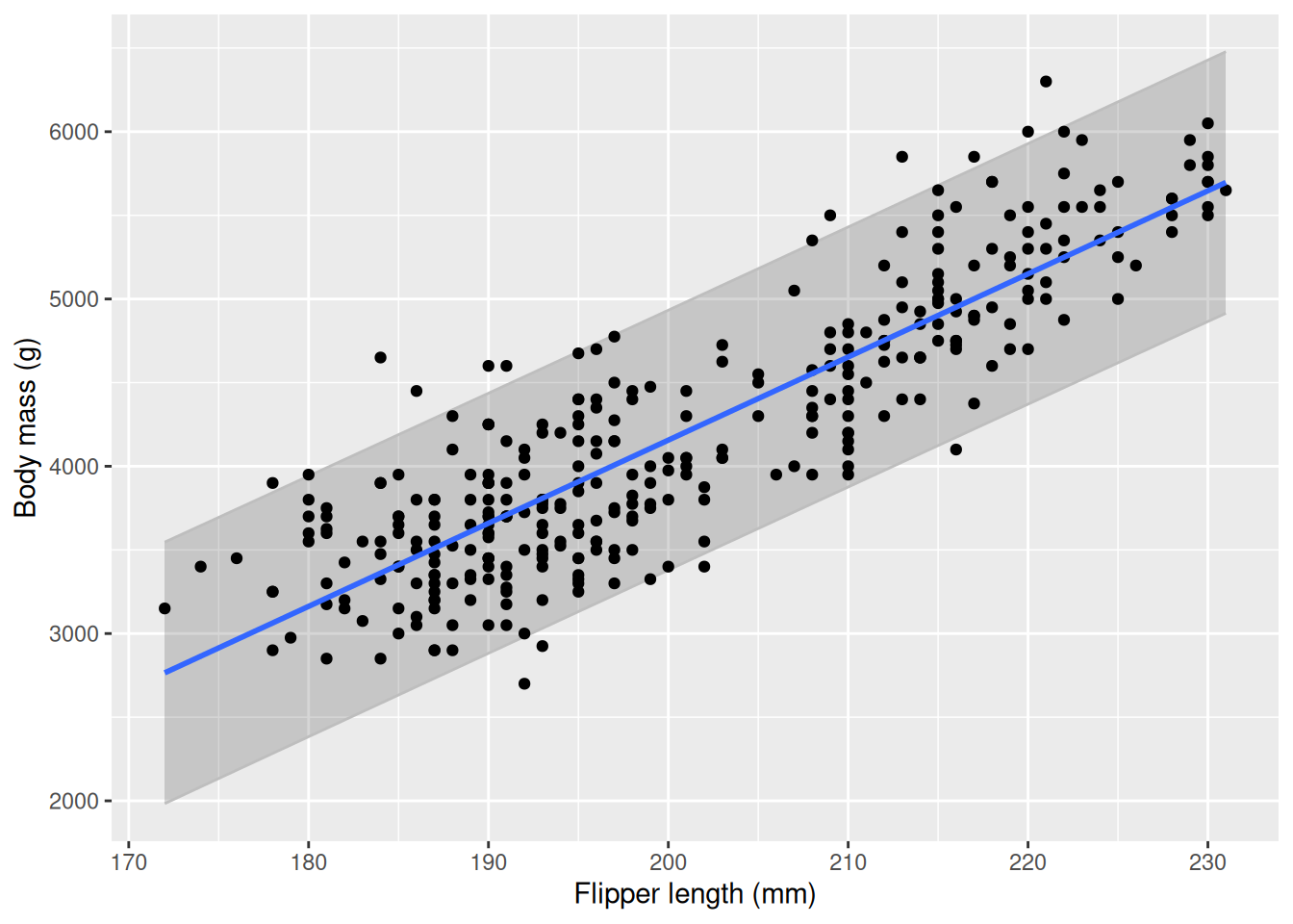
We see that most of our observations fall within the prediction interval, but on some occasions outside. With more data, the interval becomes tighter as the model is more “sure” about its predictions.
Another common interval is the confidence interval. It informs about the uncertainty of the line itself, i.e. the average value of body mass for a give flipper length. It is always tighter than the prediction interval and you can visualize it by setting se = TRUE in geom_smooth. In this course we will focus on prediction intervals.
predict with interval = "prediction", level = 0.95.So far we have only talked about the assumption that there is a linear relationship between outcome and predictor. Linear regression comes with several additional assumptions that are important for the prediction interval to be valid. We will not go into detail in these assumptions or the theory behind them and you will not be tested on them, but we will list them here so you at least have seen them.
When performing linear regression outside of this course you should understand these assumptions in order to make valid analyses.
In this chapter we have introduced simple linear regression with one predictor, except for when we included species along with bill depth. In the next chapter we will explore using multiple predictors and selecting between different models based on different variables in multiple linear regression.